Through different events, IIDA’s goal is to create community networking, highlight successes of designers, and continue education to those in this industry. The organization alternates biannually on two grand signature events which are the Interior Design Excellence Awards (IDEA) and Fashion Show.
The focus of the IDEA awards is to provide an opportunity to share and celebrate the most successful design projects with peers, as well as to inspire fellow designers. IIDA showcases the design skills and talent of those individuals right here in the state of Indiana. In turn, recognizing these achievements helps achieve the Indiana mission to promote interior design as a profession that supports health, safety, and welfare to the general public.
The 2021 IDEA Awards was especially unique as it marked the first large, in-person event held by IIDA since COVID-19 restrictions took effect. The interior design community expressed gratitude and excitement for having a reason to finally gather in person after the pandemic.
There were 85 project submissions and over 300 attendees at the events. The presentation feature of the evening was pre-recorded and streamed in three locations: Indianapolis, Fort Wayne, and Evansville.

| Your local Trimble Construction Division dealer |
|---|
| SITECH Northwest |
| SITECH Northwest |
Traditionally, the event is held live, but this year IIDA produced a video featuring the entrants, the winners, and the annual sponsors, and highlighted the last year of events in the Indiana community.
At the Indianapolis location, the main awards event was held at Tibbs Drive-in to allow for social distancing and keep most interactions outdoors. When planning for this year’s event began, the committee was not certain on how much or how little interaction would be allowed, so the drive-in proved to be the ideal venue.
- Design Team: Kaitlyn Barrett, Briana Dunkin
- Contractor: Alderson Commercial Group
- Photographer: The Addison Group
- Supporting Vendors: OfficeWorks, Specified Lighting, Purposeful Design, Interface, Eye 4 Group
This project also received the Corporate/Commercial Remodel award
Parallel Design Group (PDG) was tasked with the design of the Prolific offices, a growth strategy and growth capital firm located in Indianapolis.
PDG worked hand-in-hand with Prolific/JDA to create a space that built upon their brands and metaphorically showcased where they were going within the design. Officially partnering in the beginning of 2019, it was clear early on that each design decision would and should be made with thoughtful intention from a branding perspective.

| Your local Metso Minerals Industries Inc dealer |
|---|
| PacWest Machinery |
| Westate Machinery Co |
| PacWest Machinery |
| Westate Machinery Co |
Representative of JDA (white) and Prolific (black) within the conceptual design – the strike in color within the design signifies two different brands coming together in one cohesive space as it honors the long-standing brand (JDA) and showcases the new brand (Prolific).
Building the design concept was fun, but tricky at times for the design team as they kept the detailed design process confidential until execution. The footprint chosen hadn’t been utilized for 10-plus years. This provided a set of challenges, but with great design teamwork amongst a myriad of partners, it proved to be a forward-thinking space.
Knowing that there had been no occupant in over a decade, making sure that the building code and systems were up to date was no small task.
Prolific was not keen on creating an all-open office space but did want to have areas for open work and staff gatherings via a centralized Social Hub, which was to be the heart and energy of the space. PDG created customized focus spaces with a pod for each of their business groups, including open workstations and one closed office per pod, offering room for team collaboration and privacy as needed.
Finally – as it relates to a functional layout, PDG accounted for future hires and growth by thoughtfully considering that with just a bit of construction, build outs of future pods was doable and could be subleased until needed.

| Your local Gomaco dealer |
|---|
| American Construction Supply |
| American Construction Supply |
Aesthetically, the space has a modern vibe and earthy undertones with use of raw materials such as exposed concrete, bronze, and a walnut wood species. The space at large is intended to be fairly neutral outside of the main blue monochromatic conference rooms where much business movement occurs, and the company’s international client base gathers around the table.
Partners that made this forward-thinking space with intentional design come to life were Officeworks, Specified Lighting, Purposeful Design, Interface and Eye4Group. Additionally, commissioned Indianapolis artists added a special touch with customized art pieces throughout, all which told the JDA/Prolific brand story.
- Design Team: Amanda Clark, John Albrecht
- Contractor: Shiel Sexton
- Photographer: Michael Firsich
- Supporting Vendors: ESL Spectrum, Interface Flooring, OfficeWorks, Herman Miller, MDC Wallcovering
High Alpha is a venture studio that conceives, launches, and scales next generation enterprise cloud companies. They are led by a proven team of entrepreneurs, operators, and investors with an undeniable track record of building and scaling highly successful companies.
DKGR has a long-standing design partnership with High Alpha and its founding partners, so the team was thrilled to continue that partnership when hired to design High Alpha’s next HQ as a centerpiece of Indianapolis’ new Bottleworks District in 2020.
This bleeding edge design embodies High Alpha’s ethos for creativity, innovation, collaboration, flexibility, and hospitality while cementing the Venture Studio’s national presence and its commitment to enhancing the tech ecosystem in Indianapolis.

| Your local Somero dealer |
|---|
| American Construction Supply |
| American Construction Supply |
The project is comprised of 40,000 square feet as a single tenant within the district’s first office building. The heartbeat of the new headquarters is the fourth floor’s ‘engagement center’, with a hospitality bar, coworking areas, a digital display wall, and event stair connecting to the fifth floor’s outdoor Sky Deck.
Within the overall project are two distinct design parameters, where the third floor was designed for an ever-changing mix of High Alpha portfolio companies, and the fourth and fifth are centered around the functions of the High Alpha staff. This led to unique budgets per floor, as well as unique functions for flexibility, hospitality, and diversity of occupants in each area.
Top-tier vendor partners ESL, OfficeWorks, Herman Miller, Interface, and MDC each brought a level of expertise to a customized solution for the lighting, furniture, and digital wall-covering scopes respectively.
Browning Day – Eskenazi Museum of Art (Bloomington)
- Design Team: Lacey Causseaux, Nick Worden
- Contractor: F.A. Wilhelm
- Photographer: Susan Fleck
- Supporting Vendors: Euronique, Inc., Santarossa Mosaic + Tile, Muraflex, Bradford Systems
With the goal of redefining Eskenazi Museum of Art’s role as the “Ultimate Teaching Museum,” Indiana University entrusted an extensive design team to take on this complex project which involved a diverse set of voices from day one.

| Your local Superior dealer |
|---|
| Westate Machinery Co |
| Westate Machinery Co |
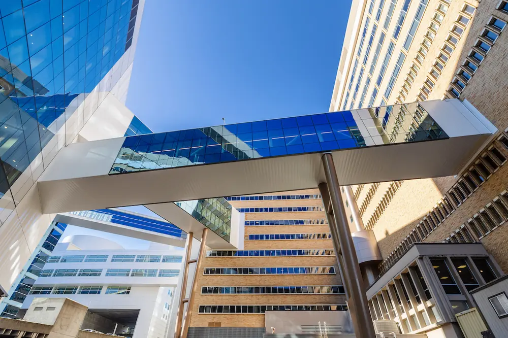
The design team focused on revitalizing I.M. Pei’s iconic 1979 structure, modernizing the building systems, improving the building configuration, and enhancing the connection to campus.
One objective centered around creating transparency – promoting connectivity, engagement, and education. Demountable glass partitions by Muraflex were installed throughout the administrative suite. New exterior windows punched into the existing concrete building created opportunities for connection to the site and the greater campus community. Viewing windows were added to interior spaces to see into the conservation studio, creating “behind-the-scenes” education opportunities for students and the general public, alike.
The over 50-year-old iconic building needed accessibility updates. With the desire to attract new visitors, accommodate a diverse demographic, and support an active schedule of programs, a series of interior renovations were made. The enhanced entry sequence leads into a monumental atrium that extends into expanded galleries, new teaching spaces and updated guest amenities.
A new third floor atrium bridge provides improved circulation and access into new galleries, including a daylit gallery and the media gallery, as well as the curatorial offices, library, and a series of viewing rooms allowing intimate access to the extensive art collection.
Bradford Systems outfitted the new 2,000-square-foot, high-density storage room with an efficient and streamlined system designed specifically to support the new Works on Paper gallery.

| Your local Bobcat dealer |
|---|
| Pape Material Handling |
| Pape Material Handling |
Santarossa Mosaic & Tile contributed significantly to the project through the quality installation of finishes throughout, but specifically in their ability to provide seamless transitions between original and new terrazzo flooring spanning public spaces, corridors, and the new bridge connector.
Euronique, a custom cabinetry vendor, built the interior millwork, reception desk, and cafe built-ins. These provided a backdrop to many of the project’s enhanced guest amenities and their attention to detail in a precise architectural environment with complicated angles and an expectation to honor and align with the existing building was unmatched.
The Eskenazi Museum of Art was updated to honor history with an eye on the future. Because of the deliberate communication, extensive collaboration, and collective vision of the diverse design team, this cultural landmark will continue to impress guests while propelling teaching, conservation, and exhibition initiatives for years to come.
- Design Team: Mark Beebe
- Contractor: Hunt Construction
- Photographer: Kristin Dial
- Supporting Vendors: Circle Design Group Engineering, Design 27 Technology, Business Furniture, Norva Nivel
Center Grove CSC provided three unique directives to the design team: Program a unique educational delivery model where ‘learning happens everywhere’; create dynamic spaces that promote social/emotional well-being and inclusivity; and embrace the latest technology and trends in safety, security, and sustainability.
Walnut Grove’s design evokes its namesake, the walnut tree. Finishes are derived from this central theme, as well as other elements unique to the state of Indiana and the seasons of the year.

| Your local Trimble Construction Division dealer |
|---|
| SITECH Northwest |
| SITECH Northwest |
Perhaps the most noteworthy illustration of this theme is the welcoming two-story entry canopy with a wood-patterned sloped ceiling referencing a grove of walnut trees. From this entry point, a unique color band within the terrazzo flooring acts as wayfinding and leads to each grade-level community.
The facility is laid out in a “serrated-L” shape with simple orientation from the main entry. This shape allowed 95 percent of instructional spaces to have direct view of the outside with large energy-efficient windows.
Common spaces are grouped at the crossroads of two classroom corridors, maximizing security and minimizing travel distances. The Media Center, located at the hub, is directly connected to the main entry blending the inside and the outside of the building. Its focal point is the “Learning Tree,” which serves as structural support for the roof and a reading nook. Students can gather on turf-covered risers near the “trunk” underneath perforated metal “leaves” that mingle daylight with light from color-changeable LEDs. The Learning Tree, also visible from the exterior of the building, can be illuminated to celebrate special events.
A STEM lab is connected to the Media Center with glass overhead garage doors. In another direction, sliding glass panels open to a two-story learning riser that supports large group presentations. One of the most innovative interior elements is the “Success Slide,” a winding slide that connects the first and second floor and servers as a setting where students celebrate achievements.
Each grade level has its own community clustered around a Collaboration Commons, which incorporates flexible furniture and technology. Classroom walls face this space with sliding glass partitions, accommodating various learning approaches and group sizes, while maintaining instructor visual connection. Each classroom has a safety nook for students to gather out of sight of the corridor during lockdown drills and classroom doors are equipped with remote door locking hardware. Student restrooms and stair towers are structurally reinforced to serve as safe zones during tornado drills.
- Design Team: Kari Funston, Stephanie Kreps
- Contractor: AECOM Hunt
- Photographer: Daniel Showalter
- Supporting Vendors: Patcrafts, Insite Art Consultants, Louisville Tile, Design Fugitives

| Your local Trimble Construction Division dealer |
|---|
| SITECH Northwest |
| SITECH Northwest |
The IU Health Frankfort Replacement Hospital design focuses on natural materials, intuitive wayfinding, timeless finishes, and efficient space layouts. Packed within 50,000 square feet are 12 inpatient beds, 10 private emergency department rooms, outpatient therapy services, lab, pharmacy, and dietary support services, and an operating suite.
A single daylit lobby with vaulted wood ceilings serves as the main waiting room and central hub for all services, as well as the dining space with a walk-up cafeteria. Multiple functions are delineated with furniture and material changes, maintaining sightlines of the open space to ground new arrivals. The most frequented services are located directly off this main lobby.
Laboratory services, surgical services, and patient registration can all be seen from the main entry doors. The additional services are located off a single cross-corridor, with periodic seating alcoves – a staff request to support the aging population served by the hospital. Department entrances are highlighted with wood wall panels and custom signage, identifying important landmarks.
At a very early stage, a timeless look which would last another 70-plus years of hospital operations was set as a design goal. The design team interpreted this through use of natural materials and design motifs inspired by the surrounding landscape of rural Indiana.
Appealing to both the locality and the comfort of the patient, serene blues, natural greens, and warm grey dominate the visual field in the hospital. Warmth is provided through natural, clear-stained walnut wood, used on ceiling planes, accent paneling, doors, and department signage. Pops of brighter colors are found in artwork and some fabrics. As the building ages, the mood of the building can be adjusted by bringing different artwork or furniture, while the bones of the building remain timeless.

| Your local Trimble Construction Division dealer |
|---|
| SITECH Northwest |
| SITECH Northwest |
IU Health Frankfort Replacement Hospital is a community-based hospital designed with the community members. From the location of the site entry to the artwork images, decisions were guided by the thought, ‘how will this impact patient care and comfort?’ Wayfinding, color schemes, department layouts, and overall feel are reflective of the community Frankfort Hospital serves and are timeless, yet flexible to grow and serve the community for years to come.
- Design Team: Eric Barr, Yvonne Gerbasi
- Contractor: Alderson Commercial Group, Inc.
- Photographer: Adam Reynolds
- Supporting Vendors: ESL Spectrum, Fredericks Casework Division, Louisville Tile, Great Grow Ins, Interface/Flor
For years, the TriCo Regional Sewer Utility operated from two locations – administrators and engineers were over-capacity in a dated Carmel office building, and the field operators worked onsite at the Wastewater Treatment Facility in Zionsville. This led to communication challenges and a cultural disconnect between the split departments. Some staff made daily cross-town trips, resulting in lost time and efficiency. When the opportunity arose, TriCo invested to centralize and expand their functions under one roof at their Wastewater Treatment Facility.
After exploring multiple schemes to best develop the 17-acre site, the most sustainable approach quickly emerged to expand their existing 7,500-square-foot main office and garage building. A pre-engineered steel system was selected for a 3,000-square-foot addition that merges with the existing structure’s skeleton. The whole building is clad in new brick and salvaged metal panel siding from the original façade, and steel shadowboxes shade the oversized windows. For glare reduction, diffusing film coats windowpanes above 8 feet, wrapping each façade with a murky datum symbolic of the water purifying process.
The original cramped offices were gutted, and half of the existing garage was converted into new communal spaces. The Training Room is a multi-functional space for board meetings, seminars, and larger public events. The adjacent Staff Lounge encourages social interactions in its generous kitchen area, featuring verdigris backsplash tile from Louisville Tile that ties to TriCo’s branding. This relaxing lounge space connects directly to an outdoor patio via a glass overhead door, and both social spaces feature expansive windows that frame the site’s landscape, which is a certified Wildlife Friendly Habitat.
Private offices and shared departmental spaces flank the daylit open office featuring stone-like carpet by Interface. Thermally efficient skylights bring light deeper into the space and support new daylight harvesting sensors. All new lighting fixtures from ESL Spectrum have rounded aesthetics, alluding to the site’s circular clarifying tanks. The building’s interior structure is highlighted with TriCo’s signature green paint, and the exposed building systems create strong visual patterns to guide one through the space, while also reflecting the company’s focus on infrastructure.

| Your local Trimble Construction Division dealer |
|---|
| SITECH Northwest |
| SITECH Northwest |
At the open lobby space, a custom reception desk by Fredericks Casework Division welcomes both visitors and staff with its warm maple canopy, branded moss wall by Great Grow INS, and glowing pendant rings. TriCo is excited to showcase their optimized headquarters during public educational tours, and to operate an energized, efficient facility for years to come.
- Design Team: Brandon Lowry, Taryn Titus
- Contractor: Capitol Construction
- Photographer: Brandon Scott Lowry
- Supporting Vendors: Bruce Longhino Group, ESL Spectrum, Hammerton Contract, Cascade Metal Design
The HC Tavern + Kitchen client envisioned a brand that resonated closely with the surrounding Hamilton County community which also set expectations for their unique culinary experience. This ground-up project provided a platform for the A&D team to showcase not only architecture and interior design (including furniture and art), but also logo and brand development for a fully cohesive narrative.
Select moments of energetic color and lighting are integrated into an overall ambience of timeless warmth and material authenticity. Elements of understated humor bring to light what makes this Indiana suburb uncommon, such as the 285 square foot mosaic mural of 71,896 vitreous glass tiles.
Upon careful observation, the aerial drone shot can be identified as a traffic roundabout, alluding to Carmel’s crown as rotary capital of the world. In addition, framed illustrations reference the region’s “Great Squirrel Stampede of 1826”.
ESL Spectrum provided maximum illuminance flexibility with full-dimming controls and LED fixtures, giving the cuisine mouthwatering appeal from brunch to late evening. Paired with decorative fixtures, including many customs by Hammerton Contract, the lighting truly allows the space to sparkle.

| Your local Trimble Construction Division dealer |
|---|
| SITECH Northwest |
| SITECH Northwest |
Every detail was considered in the planning and execution of this new brand environment. An electric branding iron was commissioned for installation of a charred logo at the corner of select tables; metal corner embellishments added after-factory, elevating the walnut slab tops. The second-floor patio space is especially inviting, introduced by an operational wall which opens fully to the interior bar.
Furniture by Florida Seating is both comfortable and elegant in form. Long-time collaborator, Cascade Metal was an exceptional partner again on this project, fabricating custom spider posts for the booth orb lighting, metal and glass surround at the two-story wine room, and brass mesh, blackened steel, and leather railings.
Acoustics are disguised in decorative details such as the felt and wood slat ceiling whose illuminated edge serpentines twenty feet above the grand dining room.
By balancing use and placement of finish materials, the conservative construction budget was carefully monitored throughout the project. There is an authenticity to the space that resonates with its brand. In its polished restraint there exists a dignity to this purposefully designed structure.
- Design Team: CSO Interior Design Studio
- Contractor: Keystone Construction
- Photographer: Tony Frederick, Frederick | Julius Photography
- Supporting Vendors: Ignition Arts, RJE Business Interiors
The Taft Center in downtown Indianapolis was conceptualized by the law firm to achieve multiple goals: to establish a ground floor presence within one of the most well-known buildings downtown, to provide a venue to entertain and host, and to expand conference spaces currently located on floors 31-35. The team met regularly to further define project goals and to identify specific needs within the space.

| Your local Trimble Construction Division dealer |
|---|
| SITECH Northwest |
| SITECH Northwest |
Taft sought to create a new modern “front door” to solidify their place as the premier law firm in Indianapolis. They wanted the space to be a reflection of the firm’s stability and strong corporate history in order to reassure clients of their decision to choose the firm for representation. Furthermore, this space needed to serve as a place to entertain and therefore needed to be welcoming and inviting.
Designers incorporated simple forms with classic material choices, balanced by distinctive design features. The clean, white, natural stone floor is complemented by the warm wood found within the lobby and is further enhanced by the starkly contrasting and branded steel divider. The composition of natural materials establishes a first impression of warmth and stability. These elements, coupled with the playful constellation of lights and identifiable repetition of the signature Taft backslash, create a space that is fresh and exclusive in the legal profession.
Those traveling beyond the lobby and ante-space experience the sleek glass corridor that conceals the conference rooms.
Understanding the sensitivities of the business that Taft conducts and their desire to maximize the glass within the conference rooms, the design team worked closely with CSO’s acoustician to design an all-glass system that maximizes acoustic benefits. This resulted in nearly uninterrupted walls of glass, which terminate at a back-printed glass panel that features downtown’s iconic Monument Circle. The conference rooms take on a sophisticated, tailored appearance that is accentuated by the sleek glass surfaces.
The cafe space, which is strategically located to incorporate a street-front presence, offers an inviting urban feel with a natural palette. The team was charged with designing the space prior to determining the vendor that would occupy it, so thoughtful consideration to space planning and material choices was key.

| Your local Trimble Construction Division dealer |
|---|
| SITECH Northwest |
| SITECH Northwest |
The blend of uniquely branded features along with a natural finish palette provide a sense of reassurance and strength. This transformed space reinforces the stability of Taft Law in Indianapolis and creates a refreshing visitor experience for clients and colleagues alike.
- Design Team: Randy Veatch, Sarah Schwartzkopf
- Contractor: Charles C. Brandt Construction
- Photographer: Todd Urban, Design Director Indianapolis Monthly
- Supporting Vendors: Kramer Furniture and Cabinet Makers, Specified Lighting, Connor Painting, Victory Surfaces, Custom Wood Floors, Inc.
A 1965 European Style cottage located in the unique Williams Creek neighborhood suffered years of neglect and at one point, the possibility of a complete tear down was discussed. Insert new high‐profile art patrons paired with an uninhibited seasoned designer and the idyllic house is once again a storybook cottage and a welcomed rebirth to surrounding neighbors.
Perfectly suited to the clients, the formal interior layout provides the necessary walls for displaying the well curated art collection. Thoughtful attention was given to every detail of this renovation. Finishes, custom furniture, and casework were balanced to compliment both the art of the bones and the original house.
The home’s first floor custom stone and wood floor by Custom Wood Floors, Inc. is more reflective of an art project than a typical wood floor installation. Additionally, designed to look like an antique found in the nearby woods, Kramer Furniture and Cabinet Makers, Inc. crafted a custom dining table further contributing to the renovation’s art-centric theme.


